 As anyone alive during the dot-com boom (and bust) will tell you, sometimes it just doesn’t pay to be a trailblazer.
Myspace used to be the prime social networking destination for online youth, but then the once innovative and exciting service soon became known for a clunky, often frustrating design and questionable user base.
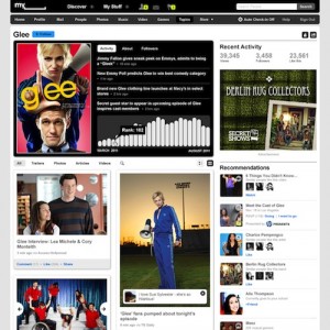
Now, Myspace is rolling out a completely redesigned and rebranded version of the site — one that focuses on what Myspace has long done best: integrating entertainment into its users’ social lives.
The new, sleek design, which is miles better than the previous generic blue scheme, places content front-and-center and is meant to make it easy to share that content — whether it’s a game, a song, or a movie trailer — with all of your friends. The site will even recommend new entertainment for you based on your interests, and lets you view your personalized “social entertainment stream” in any of the three formats that you like best (List view, Grid view, or Play view).
These certainly aren’t new features, as sites like last.fm have been socializing the entertainment experience for years, but they’re refreshingly focused for a site that once seemed in danger of having too many features.
It appears that the former social networking giant has gotten it right with this redesign, but the site still faces a major hurdle in its battle for social supremacy: Can it draw users back after they’ve fled to that other blue giant, Facebook? That’s going to be a completely different challenge.
AOL hasn’t been able to do it after the death of dial-up stole its customer base away, so it should be interesting to see how Myspace fares once the redesign is up and running for all of its users.
Check out a video highlighting some of the changes:
Welcome to the new Myspace
Myspace | Myspace Video

Comments are closed.